

Rebranding IDEAL Industries: Creating a Clearer Parent Brand Across Its Portfolio
Branding & Identity Design
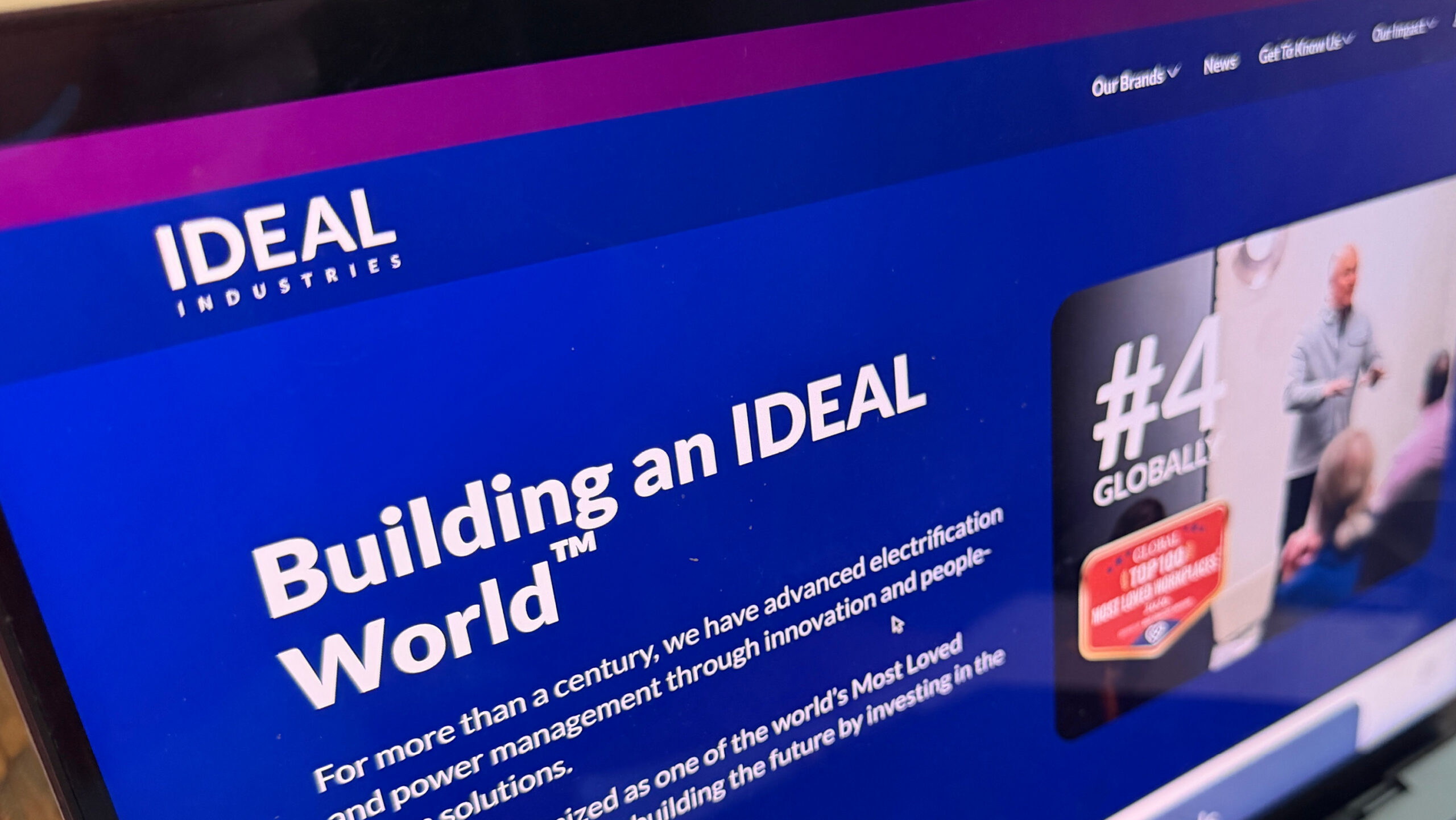
OBATA partnered with IDEAL Industries to create a clearer corporate brand through competitive benchmarking, logo design, comprehensive brand guidelines and practical brand applications. The resulting system was designed to provide the parent company with a more defined visual presence and consistent tools for corporate communications.
CLIENT
IDEAL Industries
PROJECT
Corporate Rebrand and Brand Identity System
SERVICES
- Competitive and industry benchmarking
- Corporate logo design
- Brand guidelines development
- Employee value proposition development support
- Brand template design
Clarifying the Parent Brand Within the Portfolio
IDEAL Industries is the parent company of Anderson Power, Enatel and IDEAL Electrical — three established sub-brands serving different areas of connectivity, charging and electrical products. As the organization and its portfolio evolved, IDEAL Industries wanted greater clarity and consistency in how the corporate brand and its sub-brands were represented.
The corporate identity needed to give the parent company a clearer presence, make the relationship between IDEAL Industries and its sub-brands easier to understand, preserve the established equity of the individual brands, and perform more effectively across contemporary corporate and digital applications.
One issue was particularly important: the similarity between the IDEAL Industries and IDEAL Electrical names could make the distinction between the parent company and one of its sub-brands less immediately clear.
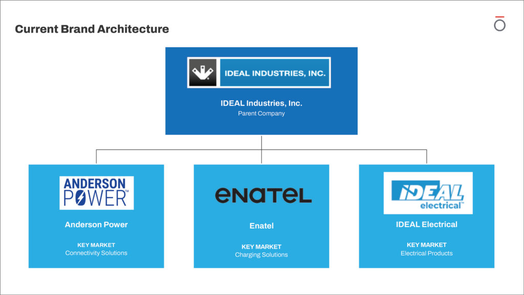
IDEAL Industries is the parent company of Anderson Power, Enatel and IDEAL Electrical, three established sub-brands serving distinct markets.
“As a company delivering future-ready electrification and power management solutions, it was time for IDEAL Industries to rebrand with an identity that better captures where we are going as an organization. We partnered with OBATA to reimagine our brand. Based on diligent benchmarking and research, the resulting design of our new logo, brand guidelines, and suite of brand assets successfully reflects a fresh and modern expression of IDEAL Industries today.”
Mikaela Maloney, Senior Manager, Content & Communications
IDEAL Industries
What the Competitive Benchmark Revealed
Before beginning logo development, OBATA benchmarked IDEAL Industries and its three sub-brands against 13 industry competitors. The analysis drew from corporate websites, annual reports, press releases and available brand guidelines.
The research examined messaging, brand architecture, visual identity, adaptability and brand experiences across the category. Four findings helped establish priorities for the new corporate identity.
Parent and sub-brand clarity
The similarity between the IDEAL Industries and IDEAL Electrical names created potential for confusion between the parent company and one of its sub-brands. The broader portfolio also lacked a consistent corporate expression connecting the individual brands.
Digital adaptability
The existing identity presented challenges in smaller social media and online applications, making scalability and digital usability important considerations for the new corporate identity.
Visual sameness within the category
Blue was the dominant visual spectrum for 53% of the brands studied, demonstrating how heavily the competitive category relied on similar visual cues.
The value of a disciplined brand system
The competitive review reinforced the need for clearer parent-level distinction, particularly given the similarity between the IDEAL Industries and IDEAL Electrical names. It also highlighted the opportunity for a more consistent corporate expression across the portfolio.
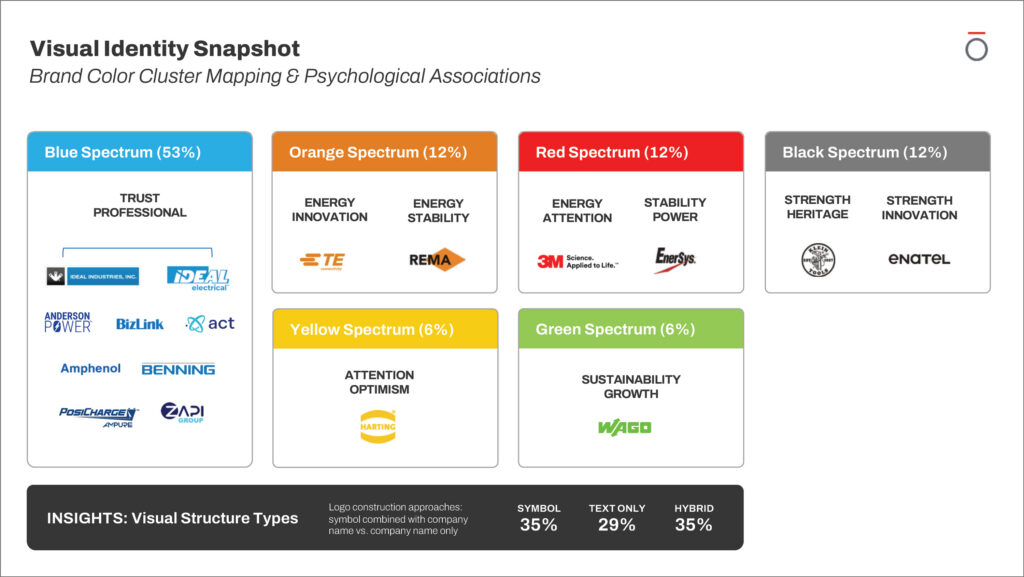
OBATA benchmarked IDEAL Industries and its sub-brands against 13 industry competitors to identify patterns in messaging, brand architecture, visual identity and brand experience.
53%
of the brands studied used the blue spectrum as a dominant visual cue.
Turning Research Into Brand Decisions
The purpose of benchmarking was not to make IDEAL Industries look different simply for the sake of differentiation. It helped identify what was worth preserving, what needed to evolve and where the corporate identity could work more effectively.
The research pointed toward several priorities:
- Give IDEAL Industries greater presence as the parent brand.
- Simplify the corporate identifier for more flexible print and digital use.
- Retain established visual equity while creating more opportunities for distinction.
- Retain the existing brand architecture while establishing clearer standards for how the parent brand and its sub-brands appear together.
- Extend the identity beyond a logo into a practical, repeatable communications system.
The benchmarking considered alternative brand-architecture models, but IDEAL Industries elected to retain its existing architecture. The work therefore focused on clarifying the parent identity and creating more consistent standards for how IDEAL Industries appears alongside its sub-brands.
The engagement also extended into employee-facing brand expression. OBATA developed Employee Value Proposition options that IDEAL Industries used to update its existing EVP. The updated EVP is incorporated into the final brand guidelines, which include the employee proposition “Meaningful Work, Meaningful Life.”
That research-first approach is also central to OBATA’s corporate rebranding process, which uses market, stakeholder and competitive evidence to inform strategic and creative decisions.
A Simpler Corporate Mark Built for Greater Clarity
OBATA designed a streamlined corporate wordmark that places greater emphasis on the IDEAL name. The simplified form creates a more direct parent-company identifier and is designed to remain legible across applications ranging from corporate documents and presentations to digital communications.
The completed logo system includes primary-color, black and reverse versions. The brand guidelines establish standards for contrast, background use, company-name styling, minimum size and clearspace to help protect the identity wherever it appears.
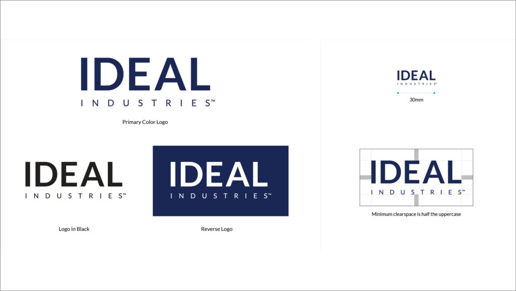
The new IDEAL Industries logo system includes approved color, black and reverse versions supported by standards for consistent use across print and digital media.
Building Recognition Beyond the Logo
The corporate wordmark became the foundation for a broader visual language designed to make the identity recognizable, flexible and practical across different communications.
Dark blue remains the primary visual anchor. Dark gray and light gray provide supporting structure, while teal and plum introduce additional contrast. The guidelines establish a defined color hierarchy so users understand which colors should dominate and which should operate as accents.
Rather than abandoning blue because it was common within the competitive category, the system expanded the ways IDEAL Industries could use it. A teal-to-blue gradient and supporting palette give the identity greater range while retaining dark blue as its foundation.
Typography provides a straightforward, technical character, using primarily Regular, Bold and Black weights to create consistent information hierarchies.
OBATA also created a repeating network of interconnected lines and nodes as a distinctive supporting graphic element. The pattern represents the connection of people, innovation and values while referencing the tools, solutions and electrical connections found throughout the industries IDEAL serves. Used across headers, section dividers, gradients and backgrounds, it creates a repeatable brand cue without competing with the primary message.
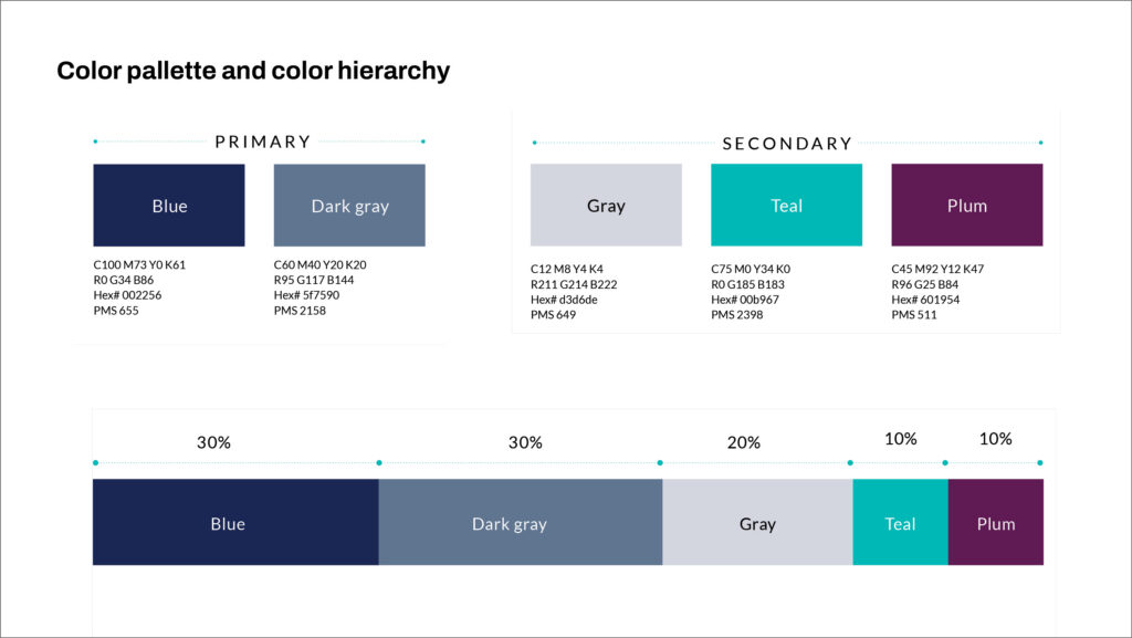
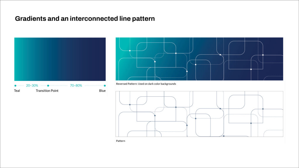
Dark blue anchors the identity while teal, plum, gray, gradients and an interconnected line pattern extend the system with additional hierarchy and recognizable brand cues.

The IDEAL Industries brand guidelines translate the rebrand into a working system, covering strategic messaging, employee value proposition, logo standards, color, graphic elements and practical applications.
Turning the Identity Into a Working Brand System
OBATA developed comprehensive brand guidelines covering use of the identity across print, digital and environmental communications. The guide provides internal teams and external partners with a shared framework for making design decisions while maintaining a consistent corporate expression.
The standards address:
- Approved logo versions, sizing and clearspace
- Color palette and hierarchy
- Typography
- Graphic patterns and gradients
- Photography direction
- Parent and sub-brand relationships
- Business and communications applications
- Employee Value Proposition guidance
The guidelines also establish how IDEAL Industries should appear when used with its sub-brands. The corporate logo is given greater prominence near the top of an application, while sub-brand logos appear smaller and lower in the composition.
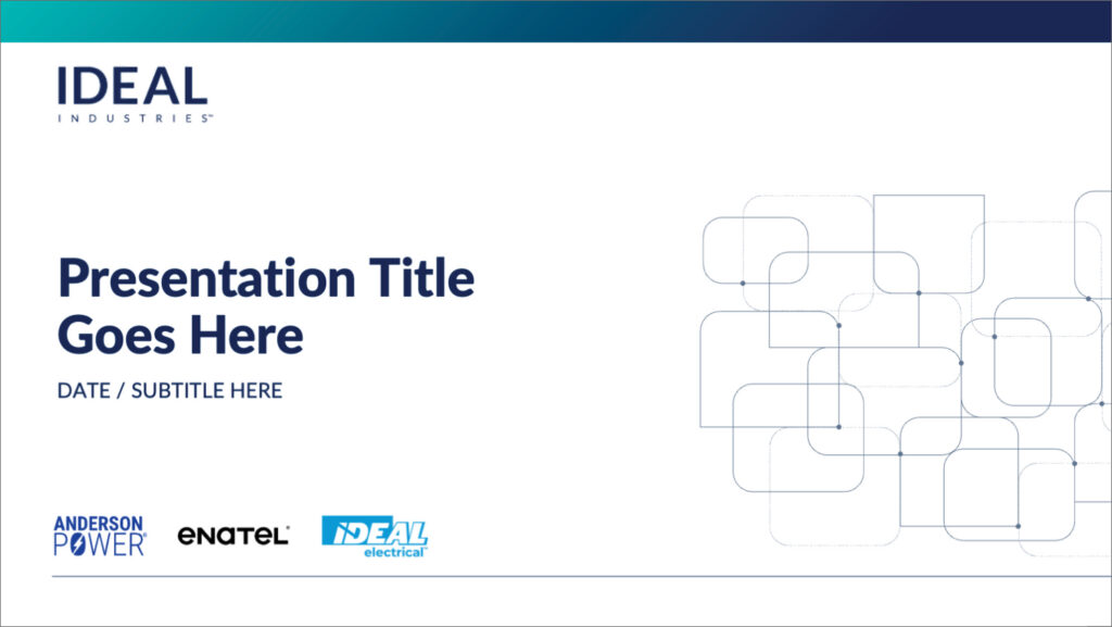
The brand guidelines establish practical rules for presenting the IDEAL Industries corporate identity alongside its sub-brands.
From Brand Standards to Everyday Communications
The final stage of the engagement extended the identity into practical tools employees and partners could use in everyday communications.
OBATA created business-card designs, a PowerPoint template system and social media graphics. The presentation system includes title slides, content pages, section dividers, data-focused layouts, photography-driven pages and closing slides.
LinkedIn profile graphics and social post templates extend the same visual system to corporate news, employer-brand communications, employee stories and other digital content.
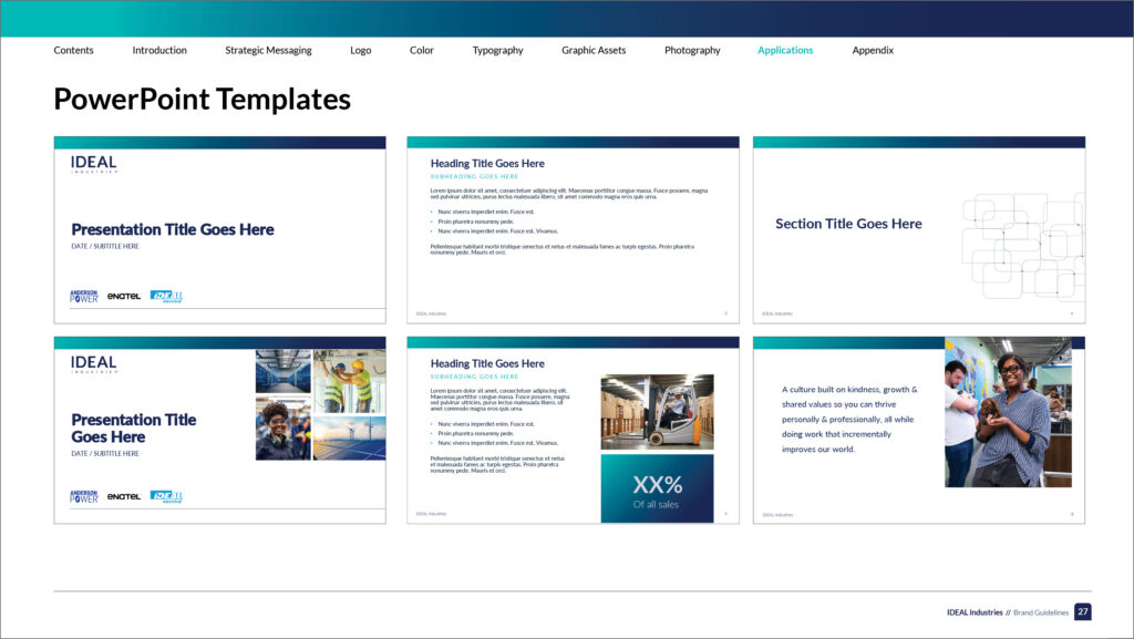
The presentation system applies the new corporate identity while providing a consistent structure for IDEAL Industries communications.
A Corporate Identity Built to Scale
The IDEAL Industries engagement connected competitive research, identity design, brand standards and implementation rather than treating them as separate assignments.
The benchmarking established a clearer basis for deciding what should remain familiar and where the corporate identity needed to evolve. The new wordmark provided a simpler parent-company identifier. The expanded visual system created recognizable assets beyond the logo. Brand guidelines established rules for applying the identity and presenting IDEAL Industries alongside its sub-brands. Templates translated those standards into practical corporate communications.
The new identity has also moved beyond the guidelines into active use. IDEAL Industries’ corporate website has been updated to reflect the new brand and visual standards, providing a live digital expression of the identity system.
Together, these elements create a scalable corporate identity designed to help IDEAL Industries represent the parent organization more clearly and consistently across future communications.
Explore OBATA’s Branding & Identity Design services for more on our approach to brand strategy, strategic rebranding, identity systems and implementation.

IDEAL Industries’ corporate website reflects the updated visual identity and brand standards in a live digital environment.
Is Your Brand Still Aligned With Where Your Business Is Going?
Whether you are repositioning an established organization, clarifying a complex brand portfolio or updating an identity that no longer reflects the business, OBATA connects research, strategy, identity design and implementation throughout the engagement.