Fortune Brands 10th Anniversary: Corporate Identity Design for a Publicly-Traded Company
Branding & Identity Design
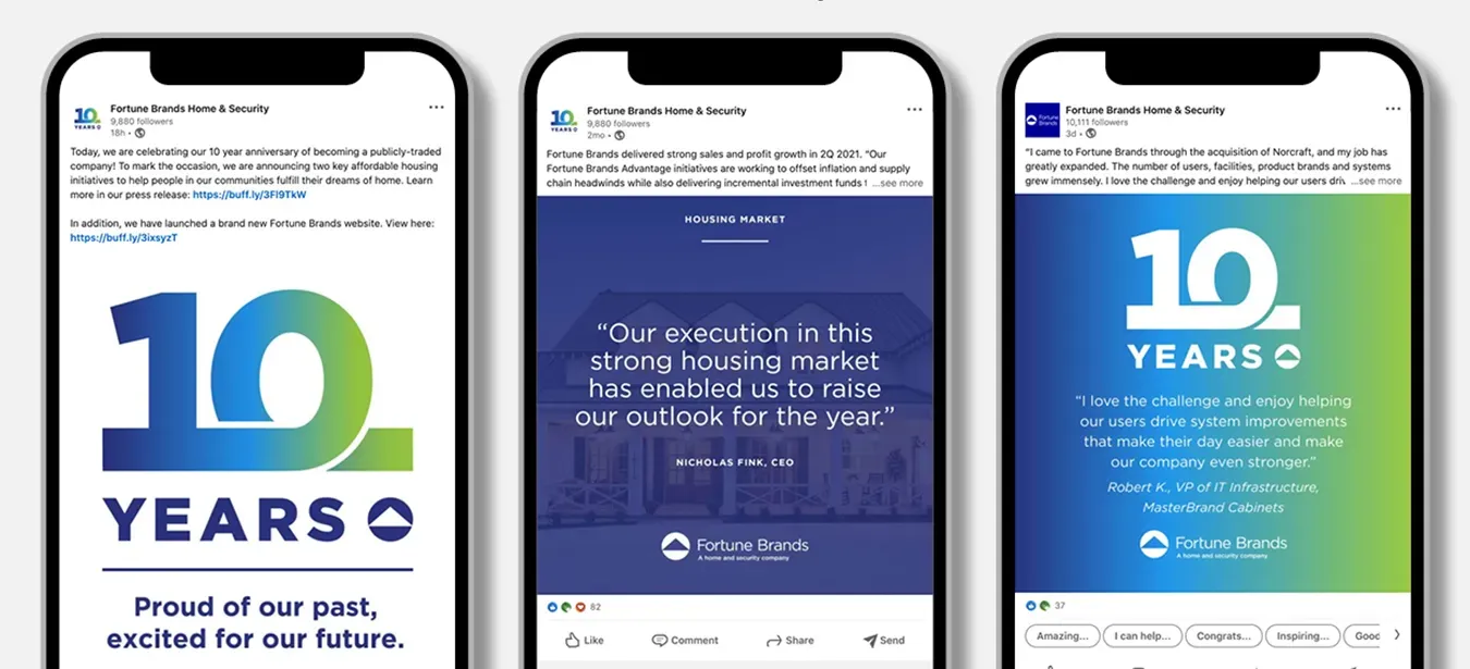
OBATA develops a corporate anniversary identity system for Fortune Brands’ 10th year as a publicly-traded company — deployed across investor events, corporate communications, and a digital campaign.
CLIENT
Fortune Brands
PROJECT
Corporate Anniversary Logo
SERVICES
- Corporate Brand Identity
- Digital Marketing Templates
- Motion Graphics
- Exterior Banners
- Media Wall
When Fortune Brands marked its 10th anniversary as a publicly-traded company, the milestone called for a cohesive corporate identity mark that could perform across investor communications, executive events, and an integrated digital campaign.
OBATA, Fortune Brands’ long-term corporate communications and branding partner, developed the anniversary identity system. Our work for Fortune Brands spans corporate reporting, ESG communications, and brand identity — making this milestone project part of a broader, multi-year strategic communications relationship.
The anniversary identity was deployed across a New York Stock Exchange closing bell ceremony, social media campaign, investor-facing digital channels, and commemorative applications — each reinforcing Fortune Brands’ brand equity at a significant corporate milestone.
Corporate milestones, such as a company anniversary, are a great opportunity to communicate a company’s longevity and positive attributes. That’s what Obata was commissioned to do as Fortune Brands approached its 10th anniversary as a publicly-traded company.
How we did it
Unlike a new branding or rebranding effort, the anniversary logo design process doesn’t need to be drawn out, burdensome, or resource consuming. In fact, if you’re working with a company that already has brand guidelines in place, creating an anniversary logo shouldn’t be burdensome at all.
Obata has developed a number of commemorative logos over the years. We have designed anniversary logos for five, 10, 25, 50, 75, and even 150 years.
Before we started working on the project, our client shared their logo design brief. A design brief is a document that outlines the scope of the project. It is the single most critical factor in ensuring that a project is successful. The brief outlined key deliverables, potential logo applications, initial tagline messaging and timing.
The design and approval process including the final production was approximately four weeks. While each anniversary logo project has its own unique set of priorities, there are a number of design strategies that we generally apply. Following them results in a simple yet strong visual that commemorates success and communicates company longevity.
Corporate anniversary identity strategies for publicly-traded companies
An anniversary logo is an opportunity to communicate your longevity and established place in the industry. It’s also a great opportunity to broadcast the company’s brand messaging. We employed the following strategies:
1. Focus on the number of years
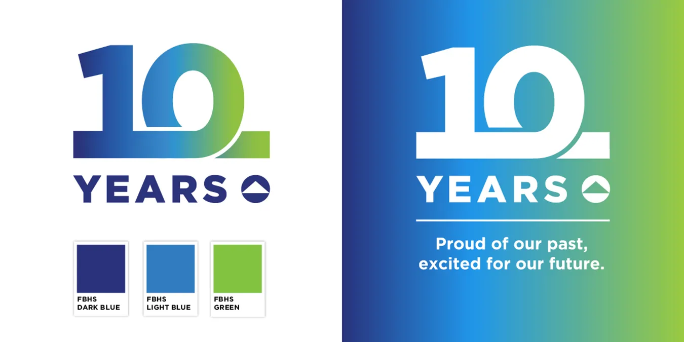
The cornerstone of the anniversary logo was a clear visual focus on the bold digits. Customers, employees and other stakeholders will instantly recognize and understand the milestone at first glance.
2. Include concise messaging tagline
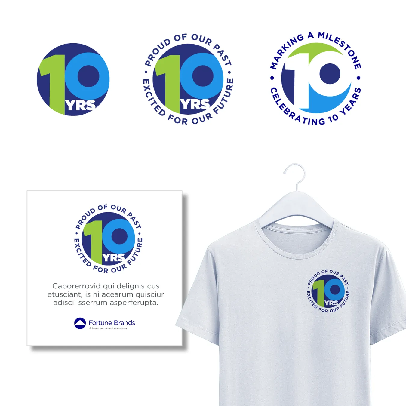
We considered and designed around a few concise messaging options. The statements reinforce the company’s pride in their past and their optimism for the future.
3. Consider adding a year range
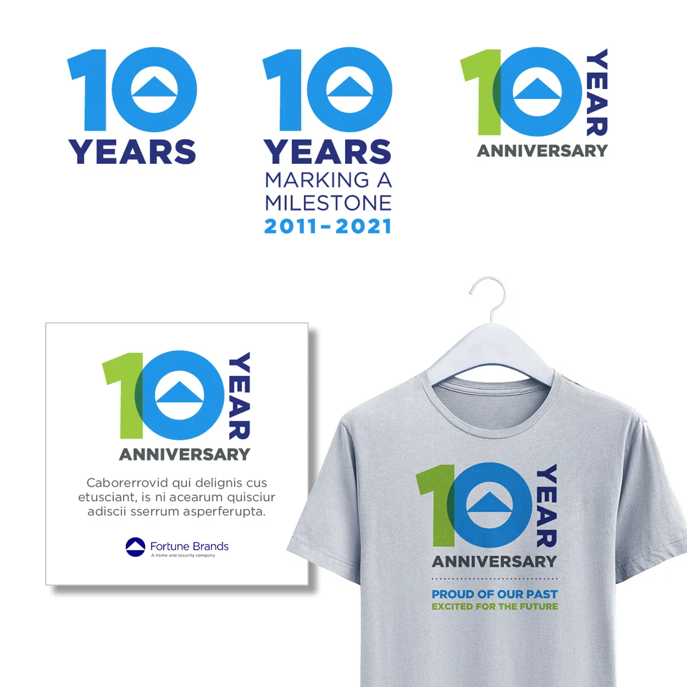
We considered including range of celebrated years as a part of the logo in the design phase of the logo. It is a simple and effective way to further communicate a company’s longevity. In the end, we – including the client – felt that the year range cluttered the message.
Presenting the corporate identity concepts to Fortune Brands
We followed our five principles of effective logo design: keep it simple, distinctive, timeless, versatile and appropriate. Using those principles, we employed an iterative logo design process to build and refine until we reached a solution.
We went through an internal review to refine and present the best logo options. We wanted to expedite the design and client approval process. So, we created a smart presentation that would quickly answer a number of questions visually for our client.
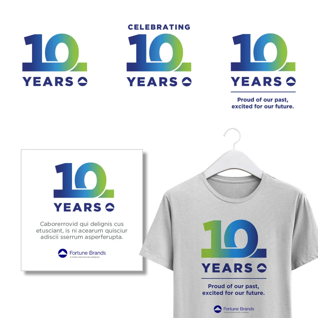
For our presentation, each option presented variations of the 10 year anniversary logo design and potential applications. Applying logos to potential applications is a great way to prove a concept’s viability.
Logo variations focused on the number of anniversary years — in this case 10, a messaging tagline, and anniversary date range.
We also demonstrated the logo’s usage on social media examples and a wearable item, such as a t-shirt. Below are a few of the logo options presented.

WHAT OUR CLIENTS SAY
“These logo designs look great! Thank you for pulling this together so quickly and providing the social media templates as well. As always, beautifully done.”
Corporate Communications Manager
Designing within Fortune Brands’ corporate identity guidelines
The anniversary logo was also an opportunity to expand on the brand identity of Fortune Brands, not detract from it. So, it was important to carry over certain brand elements to maintain visual continuity.
We considered the following during the design phase of the anniversary logo:
- Color. Color is the most important element in maintaining continuity. Initially, we considered colors outside of the company’s brand guidelines. However, we decided it was best that core elements within the anniversary logo should contain the company’s brand primary color(s).
We introduced a color blend that was new to the brand. However, using the corporate color palette we remained true to the corporate guidelines. The color blend gave the logo movement. Ending the color blend in green gave a nod to their focus on sustainability.
- Typeface. Anniversary logos allow some creative freedom in introducing new fonts. The primary visual element — the large digits — do not necessarily need to adhere to established typographic brand identity guidelines.
We elected to stay within the corporate font family, while customizing the font to create the effect and impact we wanted. We modified the extra bold numeric font. Starting at the base of the numeral 1, we added a continuous line. As the line moves right it forms a loop representing the numeral 0 before it continues forward. The line is symbolic of the company’s ongoing journey.
- Artwork. Consider including your company’s logomark or recognizable art element into the anniversary logo design.
Two of the logo design options presented included the company’s logomark within the anniversary logo. These options were proposed as stand-alone marks.
- Stand Alone or Added On? A company anniversary logo is typically a stand-alone logomark. However, we also considered the option of “adding on” the anniversary year to the corporate logo. This can be a simple and effective approach for depicting the company milestone.
As we designed, neither approach was inconsistent with Fortune Brands’ current branding guidelines.
Time to celebrate
As mentioned earlier, Fortune Brands expected to celebrate their anniversary throughout the month of October 2021. There were a number of planned applications for the anniversary logo. Applications included a dedicated webpage on the company’s new website, press release, social media campaign, a commemorative video and giveaways such as t‑shirts.
Obata treated the anniversary logo like other branding projects. We provided the client with print and digital files in color, reverse and in one color both with and without the tagline.
In addition to the logo, Obata created a series of social media campaign templates for use during the company’s anniversary year. The anniversary logo was also used as the favicon during the first month of the campaign. It’s been gratifying to see Fortune Brands successfully implement these templates during the anniversary’s campaign launch.

It’s important to take advantage of opportunities as they present themselves.
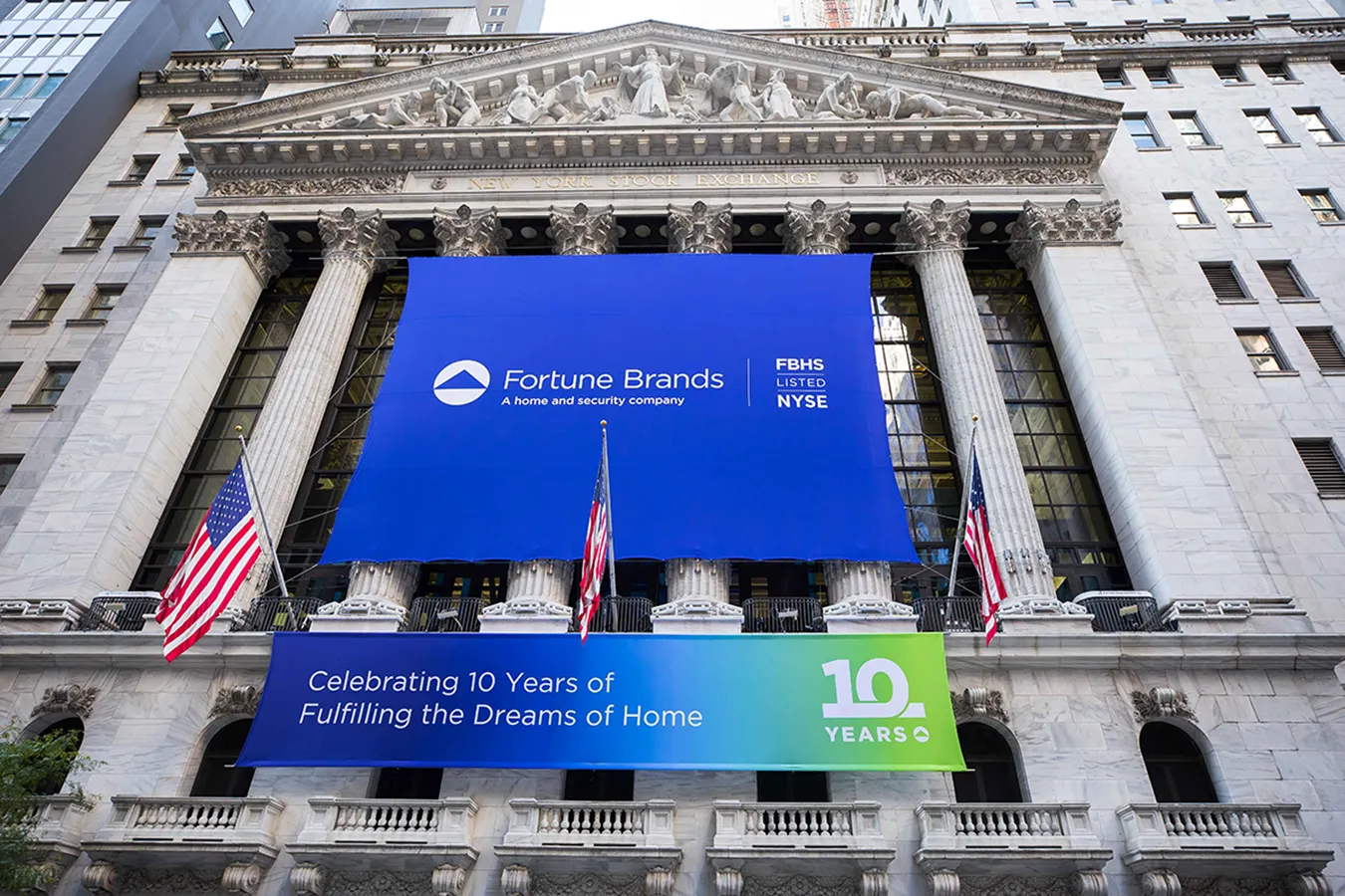
Fortune Brands had the unique opportunity to ring the closing bell on the New York Stock Exchange. The event marked their 10th anniversary as a public company. It also offered a larger-than-life platform from which to generate exposure for the company and celebrate this important milestone. Obata created exterior banners, animated signage for interior media walls and bell podium backdrop for the event.
Extending the value of a corporate anniversary identity beyond launch
Most companies are able to utilize an anniversary logo throughout the calendar year of the milestone. For Fortune Brands, the celebration period was one month – the month of October 2021. However, there will be future opportunities to use the logo and acknowledge this milestone beyond the initial rollout month.
Organizations partner with OBATA for corporate identity systems and milestone communications that strengthen brand equity and stakeholder confidence. OBATA’s corporate branding work is part of an integrated communications practice spanning ESG reporting, investor communications, and digital experience design.
Learn more about Obata’s branding services and let us help you properly mark your company milestone.