Developing a Product Brand Presence for a St. Louis Startup
Branding & Identity Design, Website Design
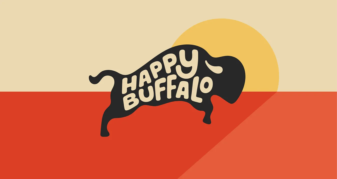
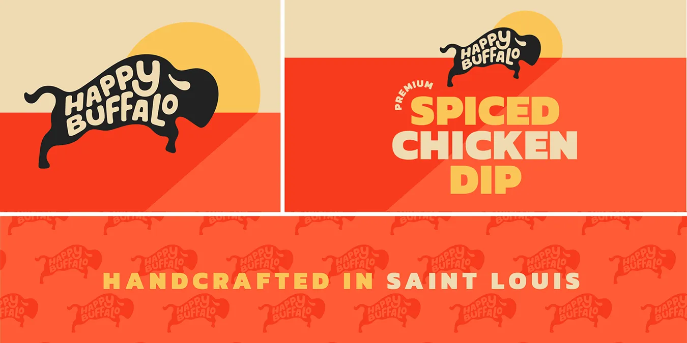
Happy Buffalo launches their new spiced chicken dip to the St. Louis region, timed to roll out before Super Bowl parties
CLIENT
Happy Buffalo
PROJECT
Business Brandmark & Packaging Branding
SERVICES
- Visual Identity
- Branding System
- Packaging Design
- eCommerce Website
Exactly what is a Happy Buffalo?
It turns out that Happy Buffalo is a dip! To be specific, Happy Buffalo is a spicy cream cheese-based chicken dip handcrafted in St. Louis. Our friends at Happy Buffalo looked to Obata to design their product brand identity and create the brand presence for their new chicken dip.
The background story. Hillary, their founder, could not find a chicken dip that made her taste buds happy. So, she made her own buffalo chicken dip recipe with lively flavor and a deliciousness only she had imagined. Since then she has been sharing it with family and friends.
New to the dip market, Happy Buffalo wanted to establish their brand presence quickly and be distinctive from the herd. To create their brand presence, our team would:
- create a product brand identity
- design a packaging label for a food product container
- design a website using an ecommerce platform to sell their product, and
- provide brand assets for their social media channels.
The target launch date was a month before the Super Bowl, the largest venue for consumer snack foods.
DID YOU KNOW?
On average, each Super Bowl viewer will eat 2,400 calories during the game alone. In total, Americans consume 30 million pounds of snacks during the game.
STEP 1: CREATE THE BRAND IDENTITY
Finding the right visual expression for Happy Buffalo
Before we explored logo options, we started asking a number of questions. What qualities or attributes does Happy Buffalo need to express? How do we express those attributes through product branding?
Questions also arose around the plastic container packaging design, from the container to the package label. How were similar products branded in this food space? What types of dip packaging containers are out there? What are cost effective solutions to create limited print runs for package labels?
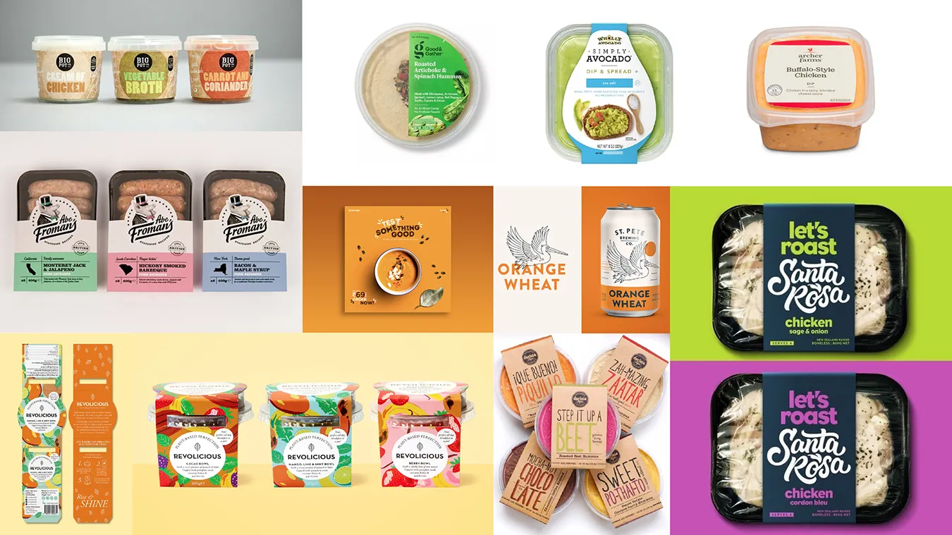
We decided we needed to do some research. Our research started on the internet. First we looked at buffalo photography and videos to help us define perspective, shape and expressiveness. Then we looked at various food packaging label examples for inspiration as well as packaging container options.
“We were determined to find a visually expressive way to deliver on what is a happy buffalo.”
Adam Franke, creative director
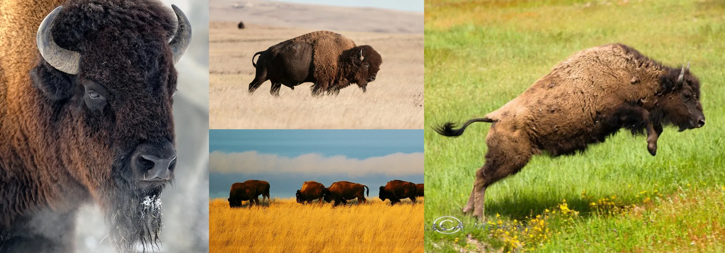
Research into American bison inspires our creative
We focused our research on the American bison. We looked at a variety of bison videos and pictures.
As we did our homework, we quickly realized that bison are not necessarily pretty animals or happy. However, they have an unmistakable shape and profile. They also travel in herds.
Close up, bison expressions look stern and stoic. However, when they were running and leaping they appeared jubilant.
Moodboard provides packaging label design inspiration
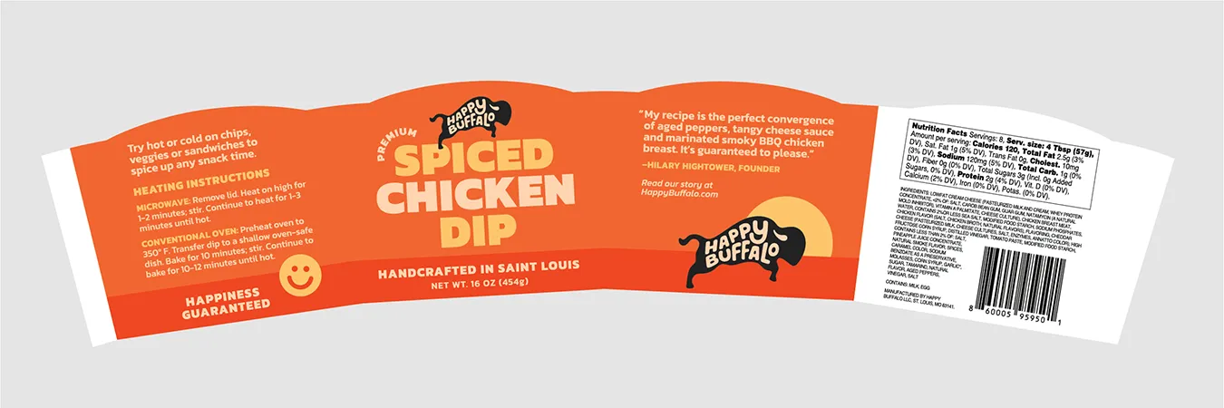
We looked at a number of different packaging and packaging label examples for dips and other foods. We considered a number of packaging label options from a cardboard wrap to a clear sticker. We decided a clear sticker worked best since it would allow the product to be seen through the lid.
Initial visual exploration for the brand identity provides direction
More questions surfaced as we started putting pen to paper. Or in our case, stylus to iPad.
What perspective or profile should we look at? A front view or side view? A static stance, running or jumping? Can typography be expressive way to convey happiness? How can color influence the expressiveness of the logo?
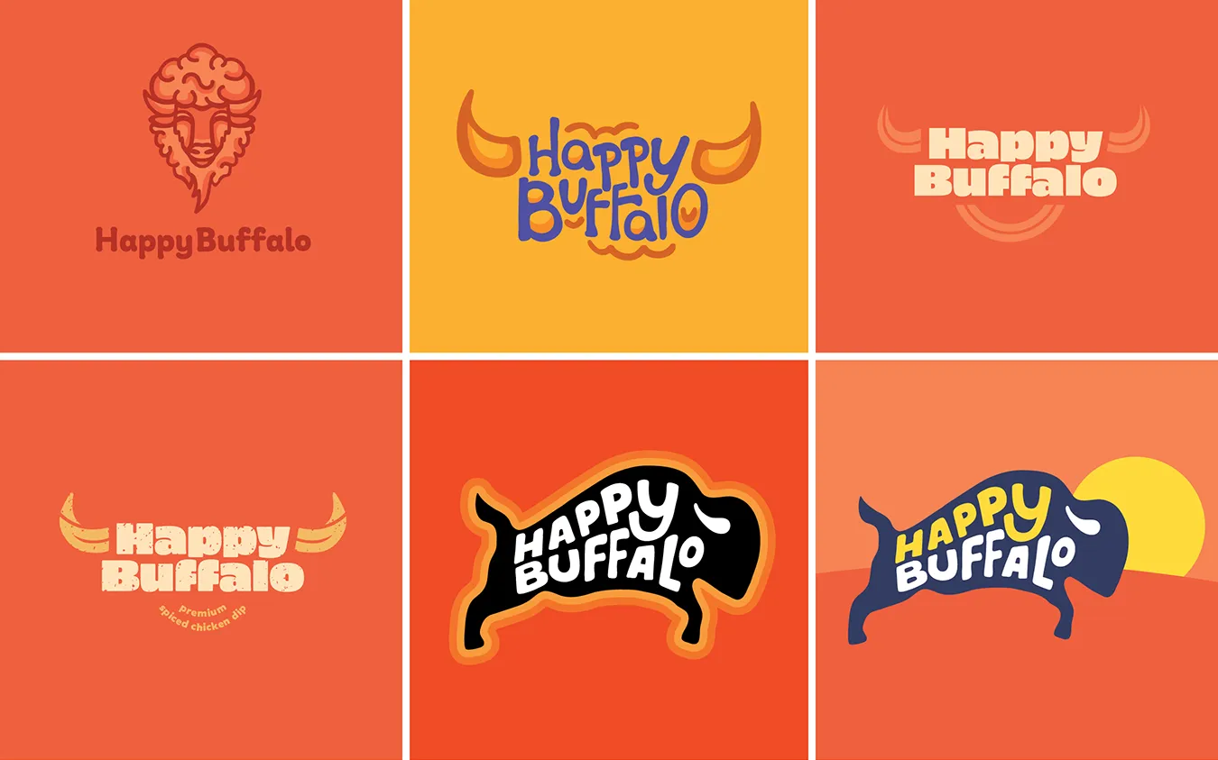
Several logo concepts emerged from our image research, and discussions between our team and the client.
The logo concepts we explored started to reveal the answers we were searching for. Some graphic expressions were too complicated, others too stylized or simple. Another looked stern while another looked like sheep or cattle.
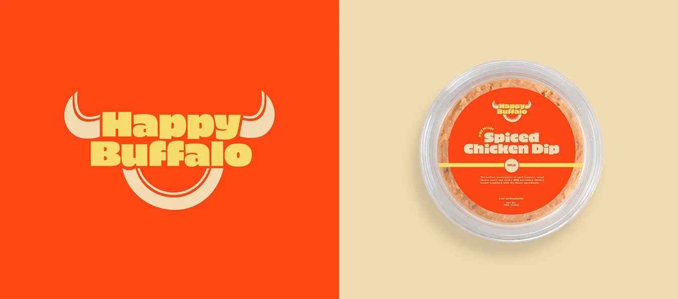
Typography and color offered other ways to express mood. In some concepts, hand drawn typography added character and a sense of whimsy. Color conveyed not only sense of spicy, but also the colors of a sunset.
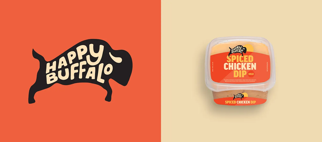
In the end, two options presented good directions to start our package label design: the running buffalo and a typographic buffalo.
STEP 2: DESIGN A PACKAGING LABEL
Food packaging label design demonstrates the brand identity in context
We decided on two logo directions. These options worked best for small scale reproduction and were bold enough to stand out on the shelves. We presented the logo designs as part of the label design for the packaging. We developed label options for both a square container and round container.
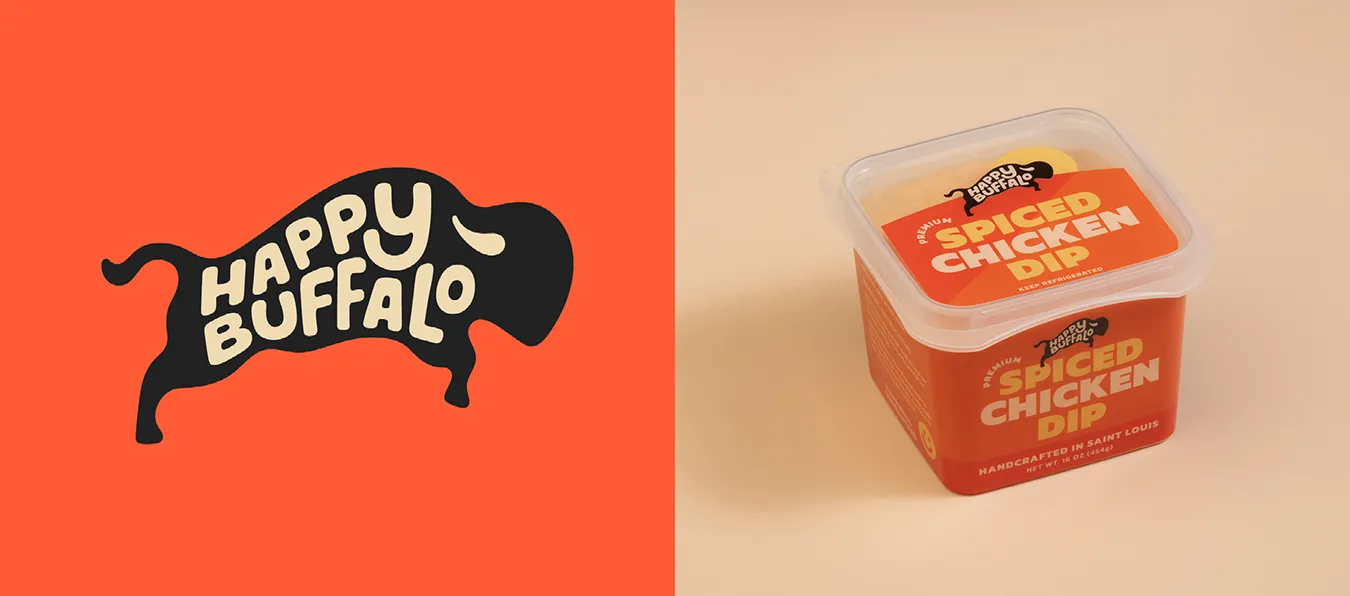
The square dip container was preferred by Happy Buffalo because it offered more visibility through the lid and it proved more durable.
Color was an important consideration
The Happy Buffalo color palette includes energetic oranges and reds paired with an earthy warmed-toned white. The chosen colors reference the look of the cheesy, spiced dip while taking inspiration from a desert landscape during sunset. The color palette was kept to five colors to give the brand an identifiable look.
Further design refinement leads us to our final solution
Due to its unmistakeable profile, the preferred direction by all was the running buffalo. The expressive hand drawn type of Happy Buffalo added to its appeal. This concept was a good start. However, we felt that we could improve on it.
We reviewed some of earlier research images again. Examples of leaping buffalos seemed to demonstrate happiness or jubilance. Further logo exploration leads us to a leaping buffalo icon. A bolder font replaced the condensed font for the product name within the label design. These refinements lead to our final solution.
Final logo artwork and color determination
The final reproduction logo and packaging label designs were rendered using RBG color. RGB swatches were chosen first because a majority of the brand assets were going to be viewed through digital platforms. Then we converted the RGB values to CMYK values.
RGB to CMKY color conversion doesn’t always provide the desired color conversion results. So, we tested the converted CMYK values through proofing and printing the label. We adjusted the CMYK formulas to achieve an ideal color match to the RGB digital formula. This process ensured color consistency, color brightness and text readability across print and digital platforms.
We ended up producing label designs for a 16 oz and 8 oz package containers. Label stock samples were sourced locally. We then tested the label samples for their reproduction quality. After testing these samples, we had a winner. One of the clear label sticker samples reproduced the vibrant colors we were looking for.
Prototype wrap-around labels were measured to fit the tapered packaging container. Final fitted labels were measured and converted into digital templates for both containers. Then the two package labels were designed to comply with FDA food labeling standards.
STEP 3: DESIGN A WEBSITE
Creating a simple online store
A one page website was a fitting and budget-friendly option since Happy Buffalo Chicken Dip is only available in one flavor. My Shopify offered an ecommerce platform to create a simple online store with a shopping cart. Simplicity and usability was the focus.
We navigated Shopify’s user-friendly platform to create a website to align with the Happy Buffalo’s brand look. We used printed label samples to mock up the containers for a photoshoot.
Then we shot food product photography for the shopping cart webpage. We prepared web-ready graphics to populate the site. Simplicity and usability was our focus.
STEP 4: SUCCESSFUL PRODUCT LAUNCH
Creating a broad set of social media brand assets
We created social media brand assets and other brand graphics. We created individual graphics complying to social media standards including Facebook profile picture and cover image and Instagram profile picture. We created additional brand assets for the website. In one of the fun visuals, we illustrate a running herd of buffalo.
A branded bag design was created so the Happy Buffalo team to hand over to customers with completed purchases. This would increase brand awareness.
Happy Buffalo’s product launch occurred about three weeks before the Super Bowl. Their startup business had their foundational brand assets for a successful product launch and market their product going forward. We wish them luck!
Looking to brand or rebrand your business?
Obata is a St. Louis-based brand identity design agency. Our team has extensive experience in branding and rebranding businesses. Learn more about our Brand + Identity services.