CNB St. Louis Bank Rebranding: Repositioning a 100-Year Community Bank for Its Next Century
Photography & Video, Branding & Identity Design
When a regulatory charter change forced Citizens National Bank of Greater St. Louis to retire its 100-year-old name, OBATA delivered a complete rebrand — new name, identity, signage, and brand launch — in six weeks.
CLIENT
CNB St. Louis Bank
PROJECT
Rebranding of Citizens National Bank
SERVICES
- Brand Strategy & Positioning
- Messaging & Tagline
- Visual Identity Design
- Brand Guidelines
- Brand Rollout Video
- Production Digital Stationery
- Signage Design & Installation Planning
- Motion Graphics
A Regulatory Deadline and a 100-Year Name
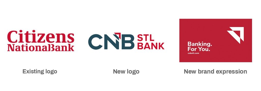
Citizens National Bank of Greater St. Louis changed their name to CNB St. Louis Bank. The rebranding process was more than a new name or new logo, but also an opportunity to honor their 100-year heritage while celebrating their growth and customer focus.
The name change was driven by the bank’s decision to change from a national-chartered bank to a state-chartered bank. Most small community banks are state-chartered plus their sister banks — Bank of Washington and United Bank of Union — were also state-chartered.
This change meant removing “national” from their name. As the rebranding process began, they also decided to remove “citizen” from their name because there were hundreds of other community, regional and national Citizens banks.
A 6-Week Rebrand Driven by a Charter Deadline
An accelerated 6-week branding process driven by the charter deadline was made possible because key decision-makers were engaged and involved throughout the process. Key branding strategies for this project included:
- Engaging decision-making team in brand workshops to understand their new naming rationale, the new name’s impact on its visualization, and develop and build consensus around core brand attributes
- Developing brand positioning and meaning for the new brand that would energize employees around a new sense of purpose
- Visualizing their brand story so that the brand’s meaning could be easily communicated by employees to current and potential customers
- Reaching current customers about the name change to reassure them that while the name is changing, ownership remains the same and their banking relationships and accounts will remain the same.
- Rebranding bank environments with temporary signage until more permanent wayfinding and signage could be installed
Designing Around the Competition
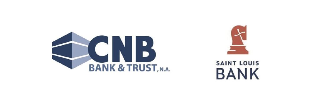
- Our visual brand research of their core competitors quickly identified two local competitors with potentially similar naming acronyms to Citizens National Bank’s new name: CNB Bank & Trust and St. Louis Bank
- Interpreted the new name visually to differentiate and avoid confusion among other similarly named community banks
- Based on learnings from the initial workshop, our team felt that there was merit to developing meaning. Initial exploration focused on three potential visual pathways:
- Adopt their URL – cnbstl
- Visually equalize CNB and St. Louis Bank and avoid any visual connection to competitors CNB Bank & Trust and St. Louis Bank
- Develop a symbolism around their unique customer focus and/or rich history
- There was great satisfaction with our initial creative exploration. However, as the workshop progressed, collectively we felt we were close but not quite there. The consensus was to abbreviate “St. Louis” to “STL” in the name – CNB STL Bank. This new pathway would improve differentiation and lead us to the final solution.
- The new logo features a triangle symbolizing the bank’s core attributes of their three-point customer focus: personal service, positive experience and accessibility. The brand attributes were further crystalized in their new tagline: Banking. For you.
From Identity to Signage: A Complete Brand Rollout
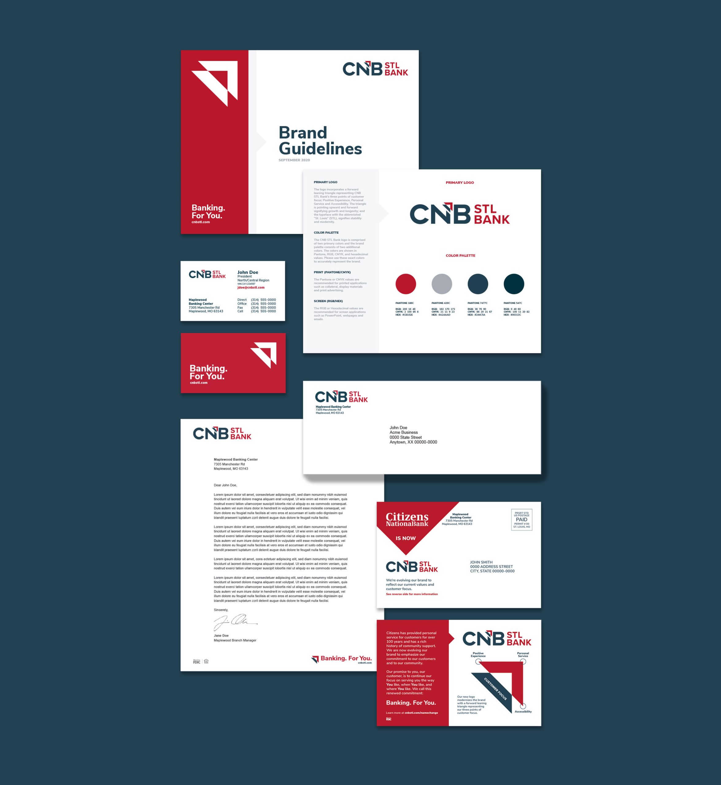
- Designed and produced foundational brand elements and materials including master logo lockups and reproduction files, stationery system and email templates
- Developed a brand rollout video to introduce the new identity, tagline and messaging and to explain to customers the symbolism of the new logo. As part of the rollout strategy, the video was featured on their website and emailed to customers to maximize exposure and engagement.
- Wrote and produced brand usage guidelines to ensure consistent future identity application
- Provided key messaging for brand rollout announcement including their news release and direct customer communications
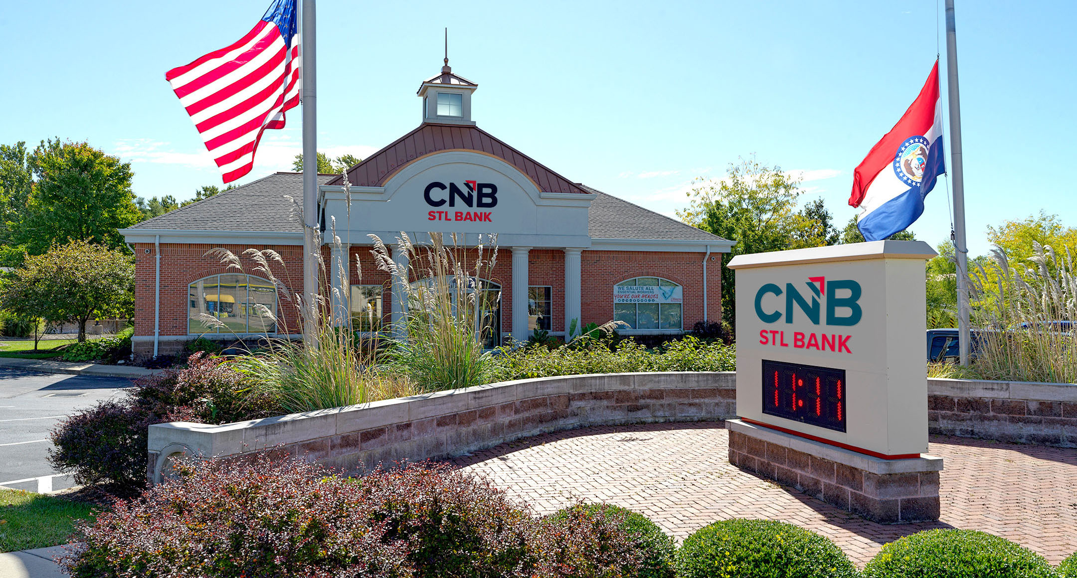
- Produced temporary signage for all bank locations that was installed during initial rollout
- Documented existing permanent signage installations and facility color schemes, then designed and standardized new signage, wayfinding, and color systems that minimized costly one-off installations and promoted greater brand consistency
Organizations partner with OBATA for rebranding programs that navigate regulatory, competitive, and stakeholder complexity. OBATA’s branding work is part of an integrated communications practice spanning brand strategy, visual identity, messaging, and complete brand rollout.